LANDING PAGE
Color Scheme
#151617
Background
Background
#27292a
Hover select
& Highlight
Hover select
& Highlight
#d9a431
Accents & Titles
Accents & Titles
The landing screen was designed from scratch by myself. Originally, the now-"projects page" was the landing screen for the site. But I wanted to include other content besides just projects on the main
page. So I decided to include the four main components; About me, my projects, a showcase of some of my work, and a contact section in case there were any unanswered questions or comments.
So far, everything I need to include has been able to fit into one of those four sections, and if I need to add another section, it is easy to do so. The header is a simple animation video
but I am planning on making it a demo reel as soon as I pull enough footage together to use. There are minimal pictures and buttons on the home page in order to make it less cluttered. I did
not want much on the first page besides text, to make navigation as easy as possible. In addition, there are only two ways the user can interact with the main screen, scrolling or changing page.
I made multiple ways available to do either of these, using a navigation bar and hints to help make the experience as smooth as possible. There are also a few hidden interactive features, one
of those is color changing text when you highlight a portion of text. (I will explain how I did that below.) The other easter eggs are left for you to discover on your own... Have fun :)
As this website makeover is very new, a lot of it is missing content. I am working on each page individually and want them to be error-free before publishing them. Many of the pages that are up are incomplete, they do not have any problems but I have just not gotten around to working on them yet. These are mainly the portfolio pages, which will never really be complete because I will always be adding work to them, but obviously they could still look nicer than the empty page they are at the moment.
The color scheme has no meaning other than I thought the colors looked nice together.
Heading Image 1
 Abstract color blob background, 3245x1080. Made in Photoshop from scratch.
Heading Image 2
 Abstract color blob background 2, 3245x1080. Made in Photoshop based off of the first image.
Heading Image 3
 Abstract iridescent background, 3245x1080. Made in Photoshop by accident while messing around with blend modes for the first image.
Heading Image 4
 Abstract 3D objects (colored), 3245x1080. Made in Blender, rendered with Eevee. Initially an experiment to test out a new lighting technique.
Heading Image 5
 Bored Sam NFT collage, 3245x1080. Made in Photoshop using the Bored Sam NFT as a base, which was designed in Illustrator and Photoshop. Inspired by the Bored Apes NFT Collection.
Heading Image 6
 Gradient Waves, 3245x1080. Made in Photoshop from scratch. I just liked the colors, also testing the hero section banner merging with the page by making the banner background color the site color.
Heading Image 7
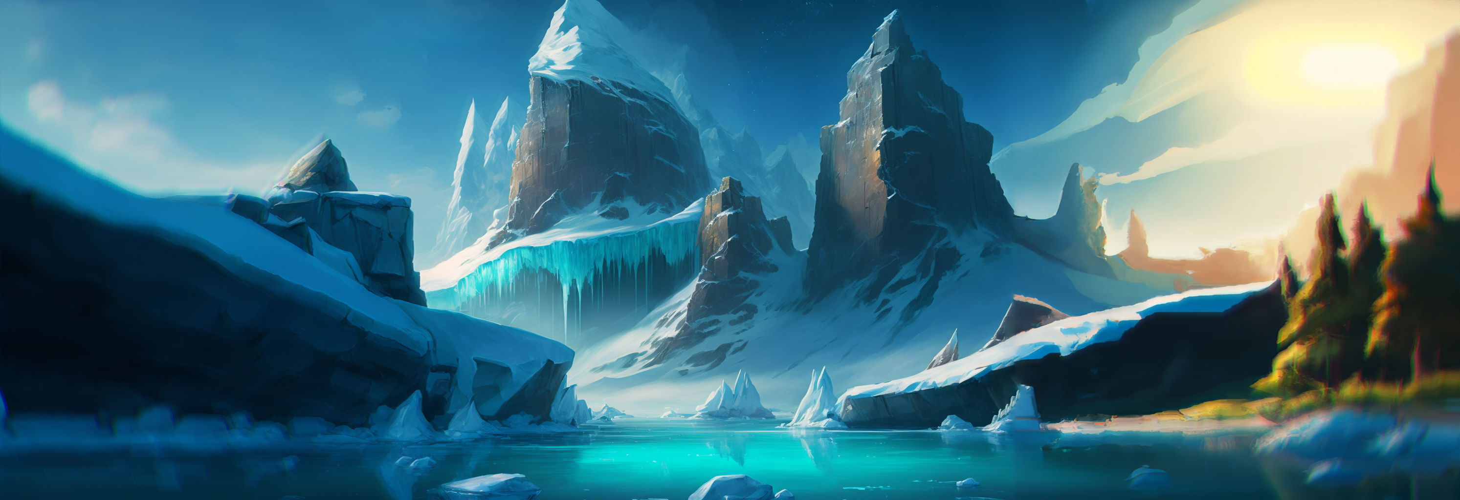
 Glaciers in the Sun, 3245x1080. Mostly done in Corel Painter 2023 and Photoshop. Made pretty much the same way as the last two, used different colors and a couple new brushes but the same process for the most part.
Heading Image 8
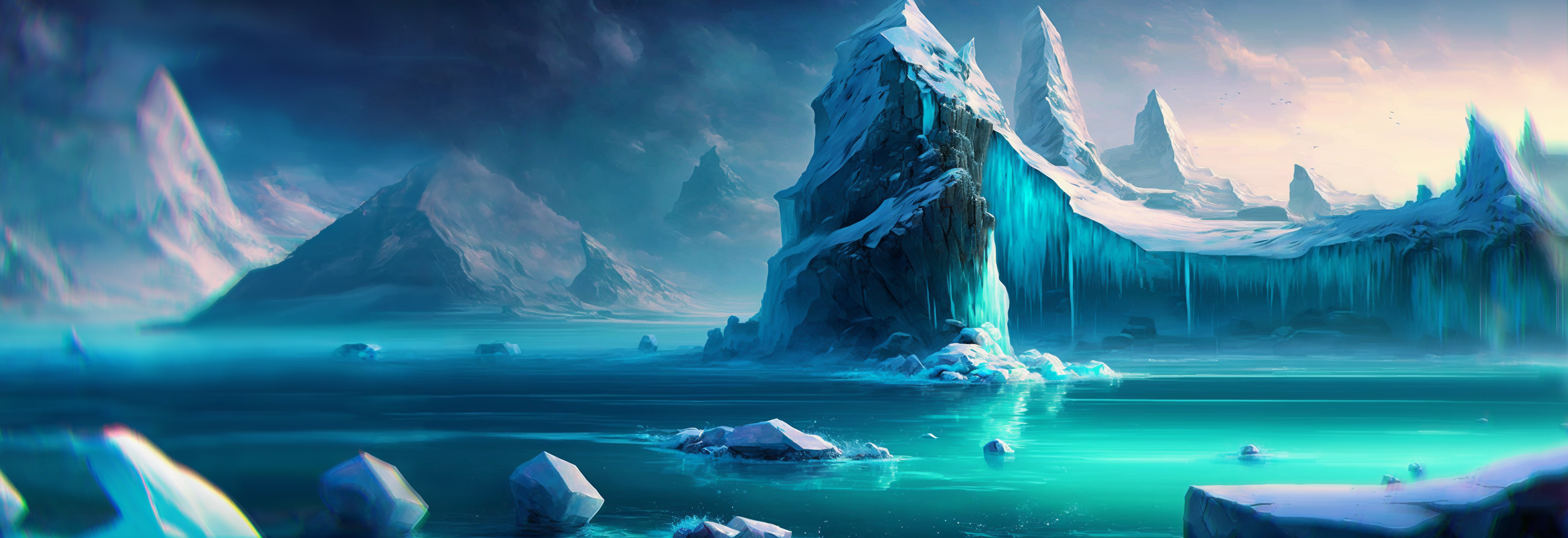
 Icebergs and Glaciers, 3245x1080. Again, same process as previous ones of the same style. Made in Corel Painter 2023 and detailed in Photoshop. My favorite art of all the banners that I have made.
The initial plan was to make a darker and more mysterious scene, possibly with dragons or an abominable snowman jawn instead of using the previous glacier image for inspiration. However, after
that picture was finished, I didn't like how it turned out so I started over and mostly stuck to the style of the previous one. After the second one was done, I thought I could combine
them to make a unique new blend in the foreground and background. So the final banner art is a composite of two images, see if you can figure out where each part of the image comes from!
Heading Image 9
 Merry Vespmas, 3245x1080. All done in Photoshop, with parts of background images coming from licensed Adobe Stock images!
Heading Image STATLE 1000
 Statle 1000, 3245x1080. Marking the one thousandth day of Statle on Thanksgiving day, 2024! statle.us/
Heading Image Featured Project
 Carda Wallet, 3245x1080. Made in Photoshop, using previously made renders of an iPhone with the app on the screen. The iPhone mockup was from Unitetheme on Behance.
The original goal was, and still is, to have a demo reel/video be playing across the top of the landing page. It is currently being worked on and will take the place of the images
when it is finished.